
Part 1: Exploring Demographic Data and Bike-Share Trips in Philadelphia and Boston
Methodology
Indego shares its trip data by quarter. The format is is .csv files, and had to be downloaded manually. Since I am only look at trips during the height of the pandemic, only 2020 and 2021 data is downloaded for this analysis. This data was spatially plotted within census tracts of Philadelphia, since I am using census tracts as my unit of analysis. Then, census data for age, income, total population was downloaded, in addition to average commute time to work, and percentage of workers above 16 who commute using bike. This data was spatially joined to trip data to create the following maps.
For Boston, similar analysis was performed. Blue Bikes data comes monthly, and was downloaded manually. The additional work for Boston was to include census tracts of Cambridge as well, since half the trips and stations occur in Cambridge. For this, all census tracts in Suffolk County (Boston’s County) and Middlesex County (Cambridge’s County) were downloaded and plotted.
Philadelphia
Philadelphia’s bike-share system is called Indego. It currently has 140 stations across the city. It started in 2015, and has added several stations and types of bikes since then. In this section, we will look at different demographic data of Philadelphia, and compare it with where most bike trips happen in the city.
Boston (& Cambridge & Somerville)
Blue Bikes has over 400 stations spread across Boston, Cambridge, Somerville and other towns. It was launched in 2011 and has had over 15 million bike rides since. In 2020, it was supported by MassDOT and Lyft to increase service.
Percentage of Commuters Using a Bike
The following maps the show the percentage of commuters using a bike to go to work. In Philadelphia, there are some tracts just south of Center City which have a high bike ridership share. Other areas include University City, Fishtown, Northern Liberties, and Spring Garden. Surprisingly, Center City has fewer bike riders, with numbers close to the rest of the city. This could be attributed to residents walking to work there. We can check this by looking at the next set of maps which show the average time of commute.
For Boston, you would need to zoom into the city. Cambridge, Somerville and Charlestown census tracts have a high bike ridership in their census tracts, while Back Bay and South End in Boston have a high ridership. Cambridge has two big universities, Harvard and MIT, which could explain the high bike ridership there.
Average Commuting Time
Commute times in Philadelphia’s Center City are comparitively lower. This could be attributed to people living and working there, and thus walking to work. This trend is seen in University City too. Commute times are higher in the rest of Philadelphia, moving further from the center.
The same is true for Boston & Cambridge.
It can be said that census tracts with lower commute time have high bike ridership. If the distance is lower to work, then ridership would be higher, since it is a strenous activity and would require good weather. Correlation with weather and bike trips in explored in Part 2. Additionally, bike tracks are mostly available in the central parts of both cities.
Median Household Income
This map shows the median household income in Philadephia. Center City has a higher median household income, and this is seen in the area of Chestnut Hill as well. Bike ridership is generally seen in higher income neighborhoods in Philadelphia, and where commute times are generally lower, though this correlation is not very strong.
In Boston, the trend is somewhat opposite. The outer census tracts have a higher income, and the central ones have a lower median household income (excluding some tracts). Because ridership is higher in student dominated areas, the income could be lower. This could show that a high number of bike riders in Boston and Cambridge are students.
Median Age
Correlation analysis in the later parts of this project shows that age is an important factor in bike ridership. In Philadelphia, younger populations are likelier to commute to work using a bike. This can be seen in the following map.
A similar trend is seen in Boston.
Bikeshare System Trips
In the following maps, the number of trips that were started in 2020 and 2021 are seen. The data above was compared to this to figure out the factors that affect the usage of the bikeshare systems.
In Philadelphia, Indego stations were only present in the central part of the city. This is where the commute time is lower, median income is higher, average age is lower and bike ridership for commute is higher (except for Center City).
In Boston, the highest number of Blue Bikes trips were started in Cambridge, West End and North End. This is where income is on the lower side, so is average age and the commute time. The bike ridership for commute is mixed.
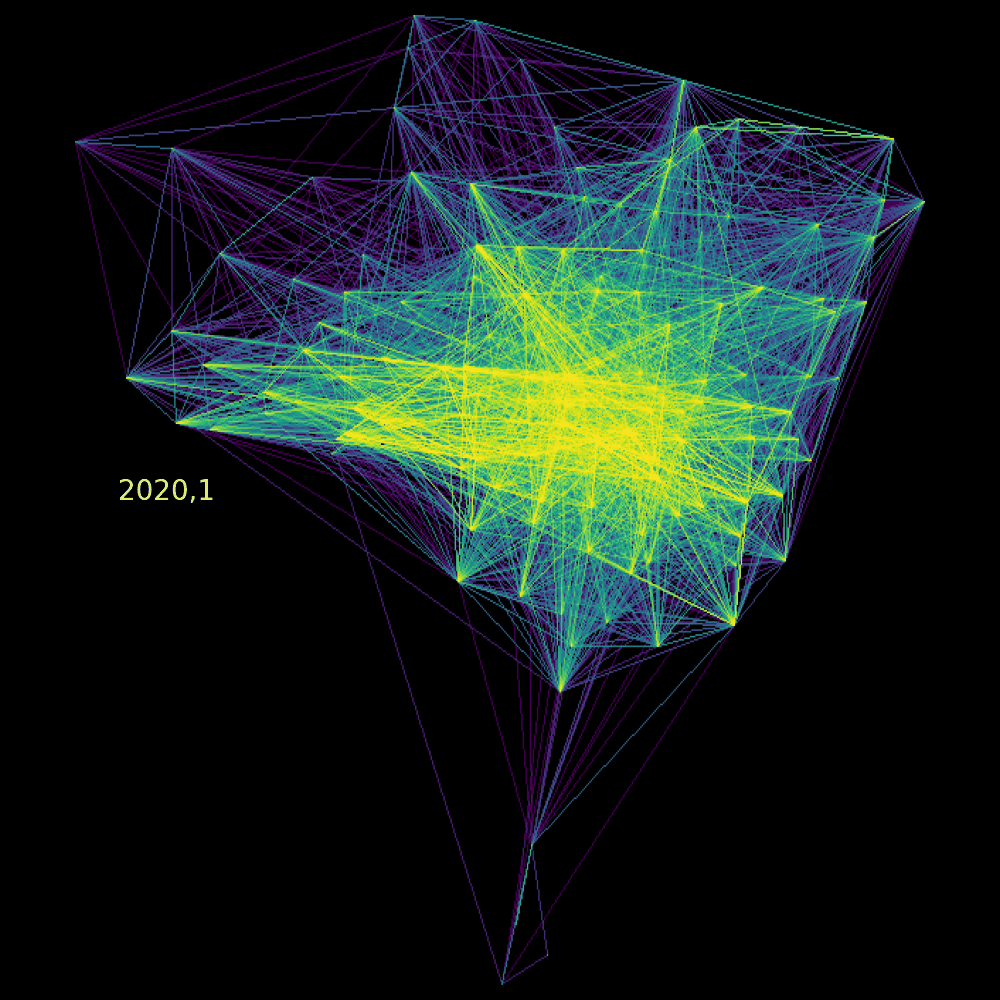
The following gifs visualize the origin-destination lines of bikeshare rides from 2020 and 2021, by month, for Philadelphia and Boston, respectively.
Indego System Trips, 2020 and 2021
Blue Bikes System Trips, 2020 and 2021