Part 2: Exploring Weather Conditions in Boston & Philadelphia, and Calculating Distance to Amenities
Methodology
Meteostat has a package to download weather data by point location. Using this package, I downloaded and used hvplot to plot trip count data against average temperature, precipitation and average wind speed by month. After this, I used seaborn to make a Pearson Correlation chart to see which weather feactors affected ridership during 2020 and 2021.
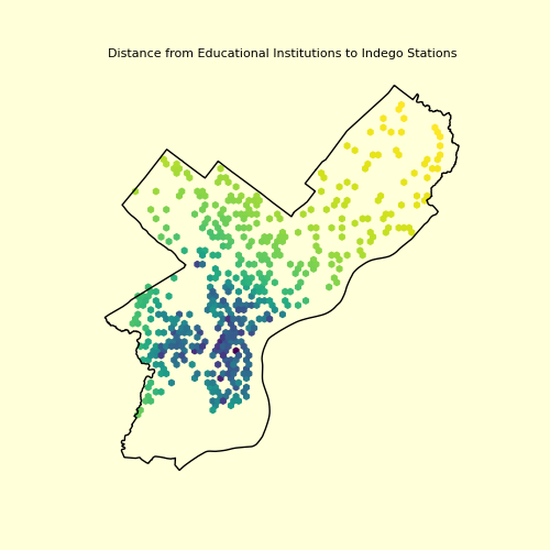
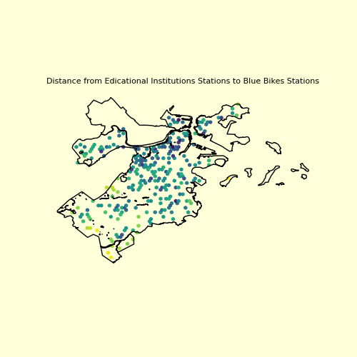
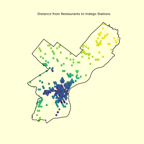
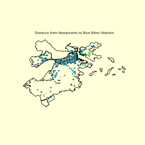
In the second half, I used OSM’s package to download point data for the following amenities: educational institutes (schools, colleges and universities), restaurants, public transit stations and bikes shops. I created a dataset of the distances of Indego and Blue Bikes stations and these amenities, which is used in Part 3.
How does weather affect bike ridership?
In this section, we explore how temperature, wind and precipitation have affected bike ridership.
Philadelphia
Weather charts can be seen as follows:
The charts above show that, in Philadelphia, ridership is higher in the summer months, when temperature is higher. Surprisingly, there is a correlation between the counts and higher precipitation too, but that might just be because it rains more in summer, and this correlation can be ruled out as a factor. The same can be applied to the wind chart, which is the last one. For wind and rain, an hour-to-hour analysis would be helpful to see if they are deterrants to ridership.
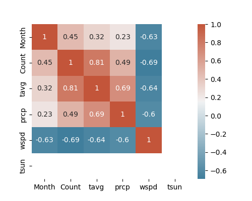
This is the correlation chart for weather and count of trips. ‘tsun’ shows number of days of sun, but the data was absent for Philadelphia. As described above, there is a strong correlation between temperature and ridership.
Boston (& Cambridge & Somerville)
Weather charts can be seen as follows:
In Boston too, there is a strong correlation between temperature and ridership.
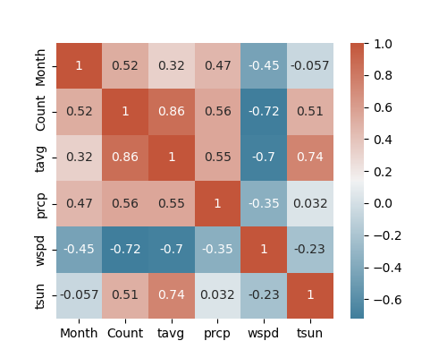
This is correlation chart for weather and count of trips. Since days of sun data was available for Boston, it can be seen that there is a medium correlation between this weather condition and ridership.
It can be concluded that temperature affects ridership, in Boston and Philadelphia. The correlation number is similar too.
Distance to Amenities
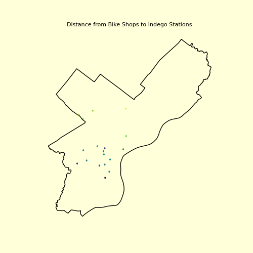
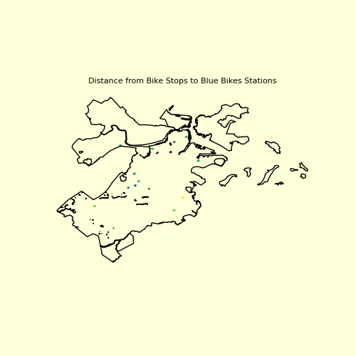
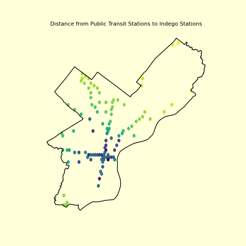
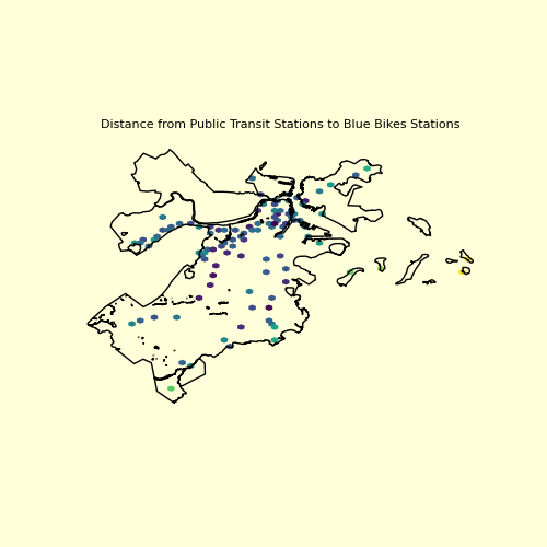
The following maps show the distance to amenities from the bike stations. The darker the color, the closer they are to the amenities. This distance data is converted to a dataframe and used in part 3 to determine if these distances are a factor in trip generation.
Educational Amenities
Restaurants (Cafes, Pubs, Bars)
Public Transit Stations
Bike Shops